After Pip and myself had showcased 'Mementos' I still had all the equipment on hire for the weekend. It felt a waste to not put it to good use and treat it as if it was a home cinema. Reuben had recently bought Daft Punks 'Electroma' and this felt like an ideal time to view it. We added the candles to enhance the dramatics's of what we were about to watch as light hearted gimmick for ourselves. These candles proved to really amplify our experience of the film and highlighted poignant moments within the film itself. The first thing to strike me about this film was it's cinematography and it's use of the soundtrack. Within one of the opening scenes there is the image of an open highway with the deserts surrounding, this imagery is coupled with a low altering bass. This was extremely similar to 'Drive' as that was the same combination I had employed. It was a moment of personal justification as I felt this film was extremely well done and very interesting in it's dialogue between image and sound and these were techniques I had come to independently of the film. The film gave me grander ideas of where I could take future film ideas and has instantly influenced me in terms of the shifts in tonal moods that sound and imagery can share. The film also had no dialogue which gave it a richer visceral impact which is something that I feel I may have touched upon with 'The Great White'. The experience of watching this film was one that will stay with me as it was the best setting to view it. This viewing along with the viewing of 'The Great White' has highlighted the importance of presentation and setting, these are things that I haven't placed such great importance on until now.
Mementos was an exhibition I am very proud of and is a great foundation on which it build my practice. With all aspects I feel that myself and Pip really executed what we find interesting and relevant to both our practices. For me it held all things that I consider important and relevant to art as a format, and was succesful in avoiding the stale, cold feeling of a white-walled gallery space.
I had always shied away from being a part of a large group of people for this module as I felt that with greater numbers comes a higher risk of a less coherent exhibition. Mine and Pip's work had originally started more similar but as both our projects evolved, the differences grew. I feel that by this happening it gave our works more individualism whilst still retaining underlining, shared themes. Our presentation methods were also going to be within the same field but as my project progressed it moved into the film spectrum, which I feel gave as much diversity as possible being in a duo. I think the room choice we made was important also as my room was road side which I felt added a surprising dynamic to my road movies. It was something that could have hindered the experience but I felt that it enriched it. Similarly Pip's room being at the back of the house gave it a meditative and calm atmosphere which really suited her content. I thought Pip's work was a monumental tribute and a true testament to her relationship with her grandmother. The quality of craft work and well thought out ideas coupled with genuine artifacts gave her ideas a full and rich body of work both with emotional gravitas and visual power.
I ordered the films so that 'Drive' was first, finishing with 'Cana', this was a very conscious decision as I felt that within that order it held two aspects of Art I find continually compelling. Firstly starting with the mundane, within 'Drive's' opening scene of being a baron highway stretching on for what seems like forever, slowly building to the abstract and pulsating climax. From this second half of 'Drive' it leads into 'Cana's' atmospheric cloud of sound and visual. I always knew that 'Cana' would be the more appealing of the two as it's much more open to interpretation and has much more of a nostalgic vibe. 'Drive' always felt like an opener to 'Cana' which is interesting as I produced 'Cana' first with 'Drive' being the last film within the series. The feedback was that people enjoyed the experience but preferred 'Cana' as it was much softer but kept with on their toes with the audio and the visuals. 'Drive'is much more of an endurance by comparison but is needed to give 'Cana' context. "It was as if you'd closed your eyes and the changing colours were from light falling on your eyelids" -Louise Hastings has summed up something that I have been trying to do for sometime and I'm very happy that this was picked up on and was something that someone saw. The most uncomfortable aspect of the night was that I had to start and end the films, it was something that had to be done to best facilitate the films. The single most uncomfortable aspect was when the films would end, people felt compelled to clap as I was in the room, If I could have changed anything about the night it would have been to rig it so that I didn't have to be there.
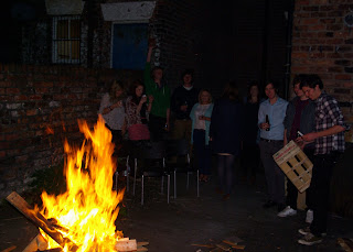
Having free drinks, cakes and a bonfire was something that we both felt was important and possible as we were housing the event within Pip's home. The setting and the atmosphere was something we were happy to welcome with our event as we felt it necessary and important to making what we considered a 'good' event. Overall the night was a very relaxed affair and felt like a success and an interesting end to my source material gathered last summer.
Once I had decided to show 'Cana' and 'Drive' it was a case of figuring out how to show them along with the finer details. I was very uncertain of how to best present those two films. Weather they would be looped one after another or if I was going to put them together only to be seen in an order during certain time slots. My thoughts on the difference in presentation method's was that the later was more suited to my work as they seemed like films that warranted viewing in their entirety. I was very much at odds towards the presentation methods. On the one hand I wanted people to see them in their entirety as I felt that was the best way to view them but I was very aware that intern I would be forcing people to sit and watch my films which makes me very self conscious. From my experience when people watch films within a gallery setting they will give the film less time then if given a cinema type setting. I knew that employing this method would ensure that the audience would watch it in full which in tern gives them a full experience giving them a grater understanding of their judgements towards it.
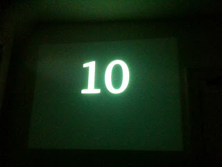
I had been watching a lot of Flux films when I was editing 'Cana' and 'Drive' together and I was always fond of the way they began, acting as an interesting uniform for them all. The style was something I was fond of too, the flickering and flashing introductions of titles and artists etc... I applied a similar introduction to both the films having a countdown before each new film started. I wanted to give the audience a chance to take a moment between films, due to the nature of them I felt that running them one after another might have been too much and would have left them overwhelmed. The countdown was 30 seconds long, this was something I felt was as suitable time between films as it would give an appropriate comedown from the first, and a build up to the second.
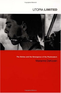
The title of the collective films came about when I was reading 'Utopia Limited' by Marianne DeKoven. She was de constructing the sixties by breaking down some of the most prominent literature such as 'Fear and Loathing in Las Vegas' by Hunter S. Thompson. In a section she breaks down Thompson's metaphor and use of the title 'The Great White' for his convertible whilst driving down the highway to Las Vegas where Thompson depicts the death of the sixties whilst referencing Herman Melville's 'Moby Dick'. I felt this appropriation of 'The Great White' was a fitting one as the films are road movies essentially but also contain my own mixed feelings of America and my place within it.
I had watched a youtube clip of Agathe Snow before going to Berlin and felt that it was a dramatic and grand way of expressing simple ideas through the use of found imagery and global symbols. My fears were confirmed as soon as I walked through the revolving doors. I really shy away for heavily political work and work that uses global companies logo's as 21st century iconography. I find it all a bit obvious and easy to do and found that she had taken one idea and was given the funds to produce monuments. The scale and grandeur of the work doesn't mask it's underlying pastiche methods of taking on certain political ideas and utopian ideals. I personally shy away from voicing my own politics as I feel that I don't have all the facts to voice a coherent and educated opinion. I find that this type of work is done by someone with my level and understanding of politics but has used found/obvious imagery highlighting major political up evils in the last half century. It felt interesting visually as the scale of it was so large and there was so much to absorb but if you singled out aspects of it they seemed weak and cliché. Volume doesn't give quality. It's low-fi and DIY aspects were the only processes that I found worked well with her own constructions of a balcony to give another angle to view the work from.
The Hamburger Banhof is the first gallery we saw whilst in Berlin. It was once a one of the first terminal stations for the rail system which is what gives the Hamburger Banhof it's distinct structure. It was converted to the "Museum fur Gegenwart" (Museum for Contemporary art) in 1996 after being reconstructed by architect Josef Paul Kleinhues. The exhibition that was on during our visit was Richard Long's Berlin Circles. Richard Long is one of the godfathers of Land Art which took fame during the sixties. I had only seen Long's work photographed insitute where his walks had originated. I thought that this idea worked well with his philosophy on his work and life and was sceptical on him bringing it into a white wall space. I realise he has been practising this method for the majority of his carrier but I always identified more with his work remaining in it's 'home location'. I felt that I had been converted once I entered the overwhelming and unexpected hall space. These two factors made me feel that the work and space worked well together but on reflection I'm uncertain of weather it was merely the space and the scale of the work that impressed me. On one hand really liked the grandeur and the nature aspects but on the other there were sloppy aspects to it. Such as the white chalk circle that they had used to ensure that the work was perfectly circular. I understand that they used that process as I would also have to employ it to ensure a perfect circle but it seemed lazy and careless to not removed the chalk once finished. I did however feel that it worked well with the other aspects of the gallery and acted as a good starting point for a range of diverse works that was spread throughout the massive gallery.
The Robert Rauschenberg series was in one of the rooms off from Long's main hall. They were a series of works that I had not come across before and instantly caught my eye. His use of photography, silk screen and colour was something that I found really interesting and was a process I felt that I could apply to the Charles Gershkovich photographs I still have lying around. They depicted his travels to China in 1982, he took hundreds of photographs and when he went back to The States he collaborated with a graphic studio. He had layered images on top of each other and played around with their colours giving them a ghostly and disjointed feel. They also felt as though he had put all the pictures on individual screens and then just played with arrangements and configurations whilst he was working, playing colours and images off one another. I felt this worked well as it gave the pictures an interesting dynamic against each other and suited the mundane styled photography whistling giving them a new collective dimension.
Whilst walking through the maze that is the Hamburger Banhof I had walked through a series of minimalist sculptures which felt me feeling cold and felt more like a glorified photo opportunity than an actual experience I came across a series of video rooms. The first of which houses the video piece 'The well-shaven cactus'-1970 by Ger Van Elk, I instantly laughed and saw this simple video piece as a breath of fresh comedic air to a potentially stale corridor of contemporary art. It's simple title and execution of the idea was something that I was instantly fond of. It's a great combination of the mundane and the ridiculous which is becoming a more prominent part with my relationship with the idea of the mundane and pedestrian.
There were moments within this exhibition where I felt that I was seeing some very interesting and challenging works of arts. There were also moments with in the exhibition where I felt that my particular tastes didn't match up to the types of art on display. It was at these moments married with the volume of intake that I felt myself merely taking photographs to fill the void. I was starting to see pieces as photo opportunities and on later reflection realised that I should have given less time to certain pieces and moved through the gallery faster and then go back to certain pieces that caught my eye initially. After this experience I don't know if I will take my camera in again as it's too easy to just switch off and click.
The 'Roots' exhibition was held at Corke Gallery with Lois Rogers, Angharad Rhys, Will Facer and Reuben Barr. It was an exhibition full of diversity and held a range of different ideas under the umbrella of the theme 'Roots'. It was a very polished evening with all the work looking very tight and focused but perhaps lost it's continuity between the differences in the different works ideas. Singularly all the works were strong but once put together it may have felt fragmented. I felt that by having Lois and Angharad in their own room with Lois having a separate room to house her video was something that worked well for them as they had previously tried to be a duo but unfortunately couldn't find a space in Wales. Will and Reuben's room was another slick part of 'Roots' having two extremes from photographic collages of Liverpool to illustrated emotions of 'Never'. The framing of these works spoke volumes about the differences, Will's frames were very swish white frames that complimented his refined photographs perfectly. Whereas Reubens were kitsch, old golden frames along side 40 individually hand drawn envelops, both suited and complimented the works within them perfectly. Reubens envelops were a personal highlight as I felt that paying £2 for a individually hand drawn piece of art was something I know is an important part of his practice and made 'Roots' a real event. Lois' video pieces of family and friend's hands along with a video of her Grandmother (Nain) were particularly strong within the work she presented on the evening. Particularly the video of her grandmother, I felt a real warmth and sincerity behind the video's and felt that she captured her feelings towards her family very well. Having her grandmother read poetry in Welsh, that she had written when she was younger was a very strong aspect and was something that I felt gave it a genuine intimacy. Angharad's work was a colourful and simplistic piece of craft work. Having Welsh poetry stitched within her colourful clouds of wool was something that I felt worked well and gave it a sense of personal purpose. All in all a very well put together exhibition from the Roots crew and a great evening was had by all.
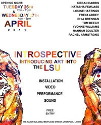
Introspective was an exhibition within the LSU presenting a range of different artistic formats. As this event took place within the office spaces upstairs from the LSU I felt that aspects worked better than others. For example Louise, Tasha and Rachel felt the strongest given they had transformed their spaces and were separated from the large office spaces that contained the others work. Tasha's work felt like a suffocating and tight enclosure that lead you into a dimly lit corner of contemplation, working well with her concept. I felt that the instant comparisons to Sachiko Abe and Nicholas Hlobo's was something of a barrier for myself as I had seen both those pieces within a relatively short period before seeing Tasha's piece. Rachel's video pieces were very well placed within her room and there was a strong continuity between the concept and the display of the videos. I could also see some similarities between her work and my own, with her use of journeys and manipulation of video. Louise's work held the most intimacy within the office spaces truly transforming the dull, white walled into an entity of itself. I really like her work and think that her constructions with old found and bought objects are very compelling and work well. I found that she took what she had captured within her sculptures and done the same with the room by covering the windows, adjusting the light and placing old newspapers on the floor acting as rugs. Introspective was an enjoyable exhibition to attend and there was some real stand out pieces.
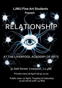
Relationship had the most artists exhibiting within the year, holding an easy majority of the year all apart of the show held at the Academy of Arts. Unfortunately it may have been my most unenjoyable of this years exhibitions. I think this can only be contributed to the volume of art on display which I felt made it hard to really engage with anyone of them in particular. There were a few pieces that I felt really shone through but unfortunately I don't know the people's names who produced the work. There was some very good photography on display that I liked and I thought that Kate Crowther Green's prints were interesting, I would have liked to have seen the more abstract ones scaled up. I understand that the scale of the space they had to work with was problematic and that's no fault of the artists but sadly I feel it was a real reason for my lack on engagement.
This is the final version of the poster that myself and Pip designed. It went through a series of versions but we felt that this encapsulated both our work well without giving the specifics of our work away. The cat is from a series of pictures I bought whilst in Alameda, California, I turned these pictures into a black and white film. The writing that lays over the top of the cat is the code Pip had to work out in order to accurately stitch her photograph's which she later turned the code into a quilt. We will be putting these around the university and also in local shops and galleries as to maximise our potential audience.


 I had been watching a lot of Flux films when I was editing 'Cana' and 'Drive' together and I was always fond of the way they began, acting as an interesting uniform for them all. The style was something I was fond of too, the flickering and flashing introductions of titles and artists etc... I applied a similar introduction to both the films having a countdown before each new film started. I wanted to give the audience a chance to take a moment between films, due to the nature of them I felt that running them one after another might have been too much and would have left them overwhelmed. The countdown was 30 seconds long, this was something I felt was as suitable time between films as it would give an appropriate comedown from the first, and a build up to the second.